A Visual Look At Shots On Target
/This is part of my efforts to try to come up with a zone rating of sorts for goal keepers. The problem I'm running into at the moment is trying to find visual information for shots against. If I want to know how good Dan Kennedy was preventing goals against Columbus in week 1, I have to go to Columbus' page on Squawka and narrow the shot data to that specific game. Basically, It just boils down to more time digging than I initially planned to devote.
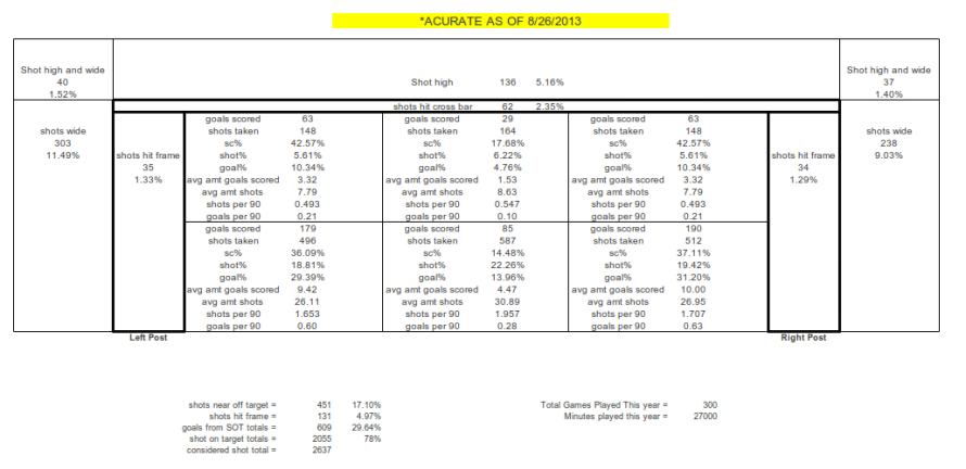
Quickly, here is a visual graphic that I made with the help of Excel. I know it's not really pretty, but it delivers the data in the manner in which I needed it without getting caught up on eccentric details, details with which I often spend too much time meddling.

There isn't a lot that this immediately tells you, of course. It's more of a jumping off point to start comparing data once it is collected. That's where the next effort is going to be headed. Who are the teams that are above league average and below league average? Are they bleeding low percentage goals, or are they being beat in an unusual zone? This information, while still miles from being complete, moves us in the right direction of knowing more about shots and goals than what we did previously.
You'll notice that I also included shots that are wide but still close to the post. I'm curious as to whether these shots numbers become inflated when playing teams with "better keepers". Unfortunately we need to define what better is. Better than what, exactly? I'm not sure. Again, parameters haven't been set, and data sets are still being gathered.
This is a fun exercise and one that should, if nothing else, provide us with some excellent insight to teams and their seasons at this point.

